Our modern world presents us with complex situations that are increasingly complicated to understand. On a daily basis, we are bombarded with information from a vast variety of sources, each with its own unique viewpoint. It is increasingly challenging to discern the truth. In all the noise, data visualizations such as charts, maps and infographics can help us analyze complex sets of information and see through to the heart of an issue.
One of the most complex and divisive issues facing us today in the United States is that of the immigration crisis on the Southern border. On one side, we are being told that dangerous people are trying to illegally cross the border in order to take our jobs and commit crime. This argument is being peddled to gain favor for the construction of a wall to keep these unsavory individuals out of “our” country. On the other side are those who believe the migration represents a humanitarian crisis, as individuals flee dangerous conditions in their homelands in pursuit of safety and freedom for their families.
Visualizations can help us better understand some of the key points in this crisis. Due to the graphic nature of information visualization, the data becomes easier to understand. These powerful images can tell a story – through the integration of text and clear visuals. Straightforward graphical representations, annotated for clarity and comprehension, illustrate key points. Embedded captions help us to locate the data that we need to make sense of the images (Dennison, 2017). These visuals re-contextualize the complex information into a format that is more accessible to the general public (Rodriguez & Davis, 2015).
By looking at the information pertaining to the southern migrant crisis in a variety of formats, we can begin to make sense of the issues contributing to this problem. The following visualizations try to answer three simple questions:
- How many people are coming into the United States,
- Where are they coming from, and
- Why are they leaving their homes in the first place?
HOW MANY PEOPLE ARE CROSSING THE SOUTHERN BORDER?
One of the first questions we can look at is whether the number of immigrants is increasing in the United States, and if yes, by how much. A simple graph, using an x and y-axis, can show us the increase in the number of immigrants over the past forty years. We could look at this information as a data table, but when presented in a graph it is easier to quickly see how dramatic the increase has been over the past few years.

Central American Immigrant Population in the United States, 1980 - 2017
Using data from the U.S. Census Bureau, from the Migration Policy Institute.
But who exactly are these individuals? We can next look at an infographic, which condenses a lot of valuable information into a simple format. The infographic utilizes a line graph, pie graphs and a map to tell a story. All use consistent colors to reduce the visual noise. Each graph is accompanied by text which provides an additional layer of information.
Again we see that there has been a dramatic increase in the number of immigrants, and therefore the number of children, starting around 2012. The pie graphs indicate that the majority are male and over the age of 14. We also see that they are primarily coming from three different countries: Guatemala, El Salvador, and Honduras.

Children Seeking Refuge in the United States
Infographic created by the American Federation of Teachers
BUT WHERE ARE THEY COMING FROM?
Why are so many families fleeing South America and trying to cross over the border into the United States? The instability of the region is a direct result of the drug trade, aided by the local governments, which has created an unsafe environment for people to raise their families.

Why So Many Central Americans Are Seeking Asylum in the United States.
Graphic created by KQED/NPR
Comics and graphic art are another way to simplify complex information in a meaningful and eye-catching way. The above excerpt from a comic highlights the three countries from which the majority of southern immigrants originate. The comic format is easy for the viewer to follow and free of extraneous information. It uses just four colors and includes very simple graphics, but clearly conveys the meaningful information.
For additional context into the nature of the violence in that region, we look to a map showing the primary drug trafficking routes in Central America. We can see that the drugs travel in several different ways – land, sea and air. These drugs are produced in Columbia and Venezuela, but they all must travel through that central triangle -the countries indicated in the comic above. When we consider that the United States has worked to shut down the air and sea travel routes, we begin to understand an alarming truth – all drugs coming from South America and heading into the United States must pass through Honduras, Guatamala and El Salvador.
Placing information such as these travel routes onto a map helps the viewer make sense of the information more easily than if it was presented as a narrative. In his piece on the history of maps, Clive Thompson insists the “persuasive power of maps was its glanceability. It was data made visual” (Thompson, 2017).
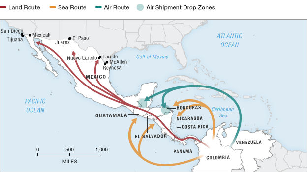
Drug Trafficking in Central America.
Graphic by NPR/STRATfor
As we look at the rival factions present in Mexico, along with the various drug traffic routes, we begin to see the unrest that permeates Mexico. The drug traffic routes are similar to those used by migrants seeking more stability north of the border. They endure a dangerous trip, often on foot, in an attempt to find safety.

Areas of Cartel Influence with Smuggling Routes
Map by Stratfor/Worldview
WHY ARE THEY COMING?
Why is this movement of drugs from South America into the United States so important? Money of course. The visualization of “the Cocaine Value Chain” shows the increase in value of cocaine as it moves farther north. The value where it is grown in Columbia is just $2,000. But once it enters the United States, the value raises exponentially. The demand in New York is so high that the value of that cocaine is 15 times its initial worth.
This map shows us the same region that we have seen in previous maps – however this time the lines are different. They flow in the same direction, but the information they present adds another layer of understanding – the increasing value of drugs moving along this path.

The Cocaine Value Chain
Map by Stratfor/Worldview
Why is the value so high in New York versus Colombia? Well the people in South America simply do not have the demand for the drug, in the same way Americans do. Looking at a density map of the volume of people treated for drug abuse, we can instantly see the demand is extremely high in the United States versus countries south of it. This special type of map uses one color in varying levels of saturation to clearly illustrate differences in demand.

People Treated for Drug Abuse
Map created by The Independent
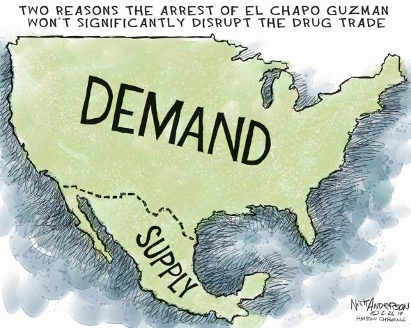
By using a variety of maps, we can begin to see the details of the demand for drugs by Americans, the limited drug trafficking routes which lead to violence amongst cartels, and the driving forces pushing families north seeking refuge. Each of the previous maps adds layers to this complex story, but the cartoon below perhaps sums it up best.
To get the full picture, watch this short video produced by Vox media, connecting America’s drug addition to the migrant crisis.
This piece was largely inspired by a wonderful presentation on the border crisis by Professor John Thomas.
REFERENCES
American Federation of Teachers. (2019). Humanitarian Crisis at the U.S. Border. [Infographic].
Beaubien, J. (2011). Mexican cartels spread drug trafficking to Central America. NPR.
Dennison, B. (2017). Practical visual literacy for science communication. Integration & Application Network.
Eleftheriou-Smith, L.M. (2015). Drug addiction: Maps show where cocaine, cannabis, heroin and amphetamines are the biggest problem. The Independent.
Jordan, M. (April 25, 2019). Judge gives U.S. 6 months to account for thousands more separated migrant families. New York Times.
McCandless, D. (2009). What makes a good visualization? From Information is Beautiful
No Author. (unknown). Information visualization: A brief introduction. Blog post. Interaction Design Foundation.
O’Connor, A., Batalova, J. & Bolter, J. (2019). Central American immigrants in the United States. The Online Journal of the Migration Policy Institute.
Rodriguez-Estrada, F. C. & Davis, L. S. (2015). Improving visual communication of science through the incorporation of graphic design theories and practices. Science Communication.
Stewart, S. (2013). Mexico’s cartels and the economics of cocaine. Stratfor Worldview.
Thompson, C. (2017). From Ptolemy to GPS, the brief history of maps. Smithsonian Magazine.
Warner, A. & Green, M. (2018). Why so many Central Americans are seeking asylum in the U.S. KQED.
Thornell, C. & Ellis, S. (2019). America’s cocaine habit fueled its migrant crisis. Vox.

0 comments on “Visualizing Migration”