Art has always been a way for people to make sense of the world around them, to observe, to document, to understand. In today’s world full of data and information, art is a way of processing that data into a more easily digested format. These days it feels like we are overwhelmed with data – constantly surrounded by facts, figures, and information, coming at us at a rapid pace. Computers and the Internet have revolutionized our ability to create, store, and retrieve information, which has resulted in a data explosion.
How can we make sense of all this data rapidly coming at us? We need to look beyond the numbers, to different formats that are easier for us to consume and share. Text and numbers are challenging for the brain to analyze – it’s much easier for humans to process content than is delivered in a visual format. The right visualizations can make people feel emotions and even change their behaviors.
Data visualization has emerged as a way to make it easier to grapple with the onslaught of data. Data visualization can help us understand concepts that are too hard to explain, analyze connections and see relationships between pieces of information. According to Russman and Svensson (2017), “this shift towards visual increasingly transforms how we relate to each other and the world around us, as well as how we perceive and construct our sense of self.”
Data visualization is the “graphical representation of information and data” (Tableau blog). Data visualization employs several basic visual components including line, shape, color, and quantity. Visualizations rely on Gestalt principles to tell their stories – through simplicity, proximity, similarity, continuity and closure. These design principles help convey the meaning of the data.
Data visualizations can be taken a step further, into the tactile world of three-dimensional structural artwork. Many artists have adapted the concepts of data visualization into a wide variety of mediums and art-making processes. They work with color, line, and weight to deliver meaningful visualizations. These visualizations rely on accurate data, have a strong underlying story, and work towards a specific goal. Using different mediums, artists can evoke a strong reaction from the viewer, with obvious story, mood and themes – while the data itself becomes almost invisible beneath the surface of the artwork. These visualizations invite the viewer to dig deeper and explore the underlying meaning.
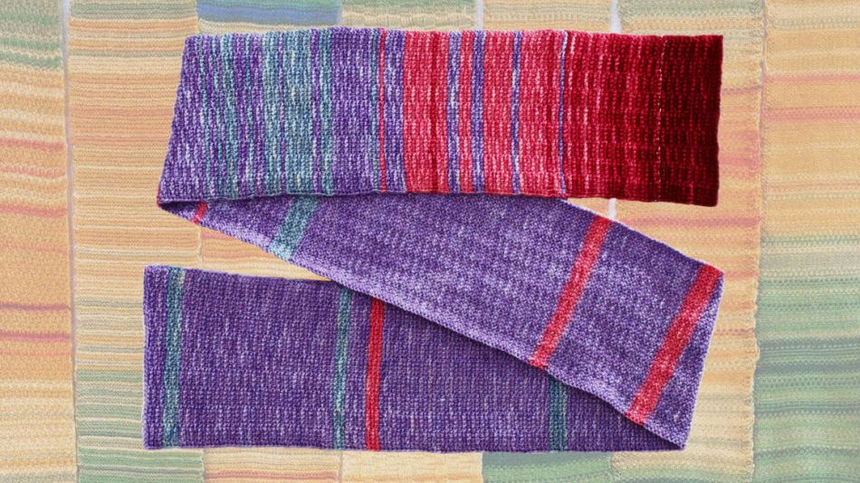
Craft is a way to present data in a novel form, which can in some ways make that data more compelling. Marine scientist Joan Sheldon crocheted a scarf (pictured above) based on the global average temperature from the 1600s to present. Purple yarn was used to represent normal temperatures, blue for below normal temperatures and red for above normal. The scarf gets darker and redder towards the end, showing how our planet has been gradually warming over time. When Sheldon shared the completed scarf at a scientific conference, she was surprised by the response. “Even scientists who were familiar with the data wanted to touch the scarf, to find the year they were born…They never would [do this] with a science graph,” she said. “It approaches you in a different way.”
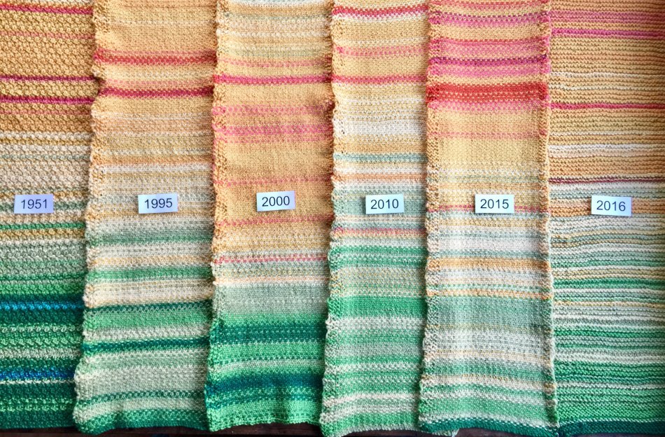
Weather and temperature data seems to lend itself quite easily to the craft of fiber arts. The Tempestry Project creates similar scarves based on global temperature data. The Tempestry Project started in 2017 in direct response from the lack of government action to combat climate change. The Tempestry group supplies temperature data from the National Oceanic and Atmospheric Administration (NOAA), for a specific town or city to knitters around the world. They assigned a different color yarn to represent each temperature in five degree increments, from -30F to 121F. By crowdsourcing the knitted tapestries at locations around the world, the results over several years begin to show patterns and changes in the global temperature. According to the Tempestry website, “One of the ongoing problems inherent in discussions about climate change is the vast scale of the conversation. The Tempestry Project’s goal is to scale this down into something that is accurate, tangible, relatable, and beautiful.”
Data artist Natalie Meibach similarly explores weather patterns, but using sculptural techniques instead of yarn. For her project entitled “The Weather Score,” she begins with weather data, which is then translated into a musical score. From the musical score, she builds a sculpture using everyday materials. Meibach’s work seeks to explore how human emotions influence the perception of weather. “Metaphors play an important function in creating a more layered approach to building narratives with data, while also suggesting a parallel, futuristic and darker outlook,” said Miebach.
In the above piece, The Burden of Every Drop (2018), Miebach looks at the violent impact of rising waters as a result of increasingly powerful storms that have ravaged the world. This sculpture combines weather data, news reports and personal narrative to try to capture the devastation, destruction of property, and the challenge of rebuilding.
Natalie Miebach’s Changing Waters (2012) combines NOAA data along with fishing reports, to tell a visual story of the interaction between wildlife and atmospheric changes in the Gulf of Mexico. In the details we can see the repetitive use of patterns and variations in color to represent the data and tell us the story in a way that cannot be absorbed through facts and figures. The immensity of the sculptures has a dramatic and emotional impact on the viewer, the magnitude of filling a room echoes the magnitude of the impact of climate on our daily lives and the world around us.

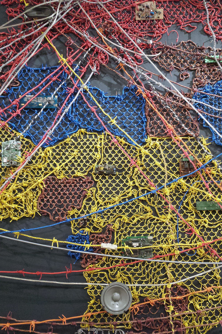
Artistic data visualizations can also take on a more concrete, less abstract form to tell us a story too complex for words. Reena Saini Kallat’s Woven Chronicle (2011), uses electrical wires and circuit boards to plot the different paths of human migration throughout history. This style of artistic visualization can really highlight patterns which may be more difficult to see in other formats. The connection of the wires between different locations helps us to envision the movement of people across the globe. The wires serve not just as an artistic statement, but also as a functional way of connecting circuit boards and speakers throughout the piece. The speakers play ambient noise of sounds both natural (birds) and manmade (machinery) which fill the gallery. The wires themselves are twisted into a form reminiscent of barbed wire, recalling the boundaries that keep us apart.
Data art does not always need to be made from public, global data. Many data artists have turned this concept around to the micro-level, leveraging data from self-tracking apps to create visualizations of their own lives. New father Seung Lee documented his baby’s sleep patterns in a knit afghan. About the blanket, Richman-Abdou (2019) writes, “Each row represents a single day, while each stitch symbolizes six minutes of time spent awake or asleep, culminating in a detailed reading of his son’s shifting sleep patterns. Lee spent 300 hours over the course of 104 days completing the cozy keepsake blanket, which ended up measuring 42 by 45 inches and featuring 18,500 stitches.” The blanket will serve to commemorate this special time in the family’s life, while also telling a complex data story of the sleep patterns of a newborn baby.
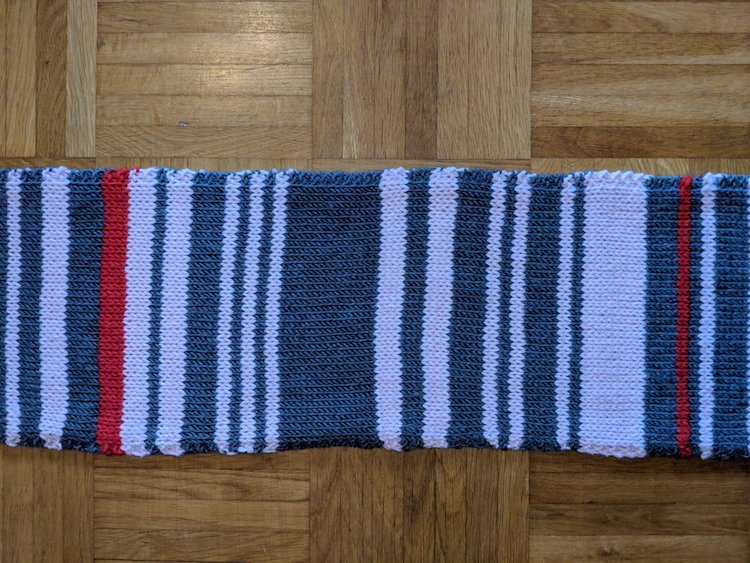
German knitter Claudia Weber found that creating her own data visualization served as a way to cope with a stressful situation. After experiencing significant train delays on her daily commute, Weber started recording the patterns in a knitted scarf. The white stripes show days when the train was on time, while grey denotes a slight delay, and red shows a delay of over 30 minutes.

Data artist Laurie Frick is perhaps the most prolific and well known artist who derives her abstractions from self-tracking personal data. Frick believes that, “in all of these patterns, I think there is an essential idea of who we are.” Unlike the previous pieces of data art, which each included a key for unraveling their meaning, Frick believes in keeping the data itself private, letting the work speak for itself as a visual abstraction. In Night (2009), above, Frick represents data from her walking app documented over a two year period. Incorporated into the number of steps and overall distance are Frick’s moods, perceptions and even internet use. The overall piece of artwork is stunning.

In Sleep Drawings, Laurie Frick uses paper, ink and watercolor to represent her sleep patterns tracked from 2010 – 2012. Frick believes that we can use data in a way that can transform our lives, that the data itself is “superpowerful”. She inspires us to ask the question, “What if you find all of these ways to see yourself, and it’s a whole other way to see yourself?”
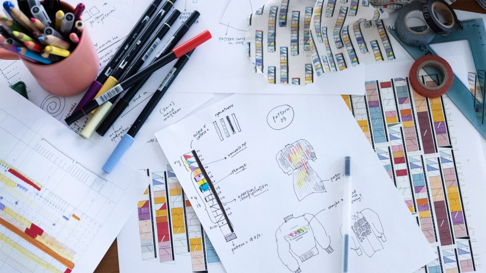
Data artist Giorgia Lupi has turned the focus of her data collection to the lives of other women, famous women who have had a profound impact on our world: Ada Lovelace, Rachel Carson, and Mae Jemison. Based on data gathered from their lives and work, Lupi created data visualizations combining symbols, patterns and color. Looking at these patterns she had a thought – why not turn them into clothing that others can wear? Working with textiles like cotton and wool forced Lupi to consider the patterns a bit differently than when they are going on paper. Giorgia is famous for finding the humanity in the data, as she believes that, “Data humanism is my way to reclaim a more human approach, even if that means adding imperfect human qualities.” Her newest data visualizations patterned onto clothing allow others to wear that data and embrace those famous stories.

Visual data stories expressed through art have a strong impact on the viewer because they are authentic and based on real data. They provide complex sensory input through their arrangement of shapes and color, and they are culturally relevant to our time. Creative expression of data visualizations is just one more way that we can process the vast and complex data we encounter daily, and place it into a context that evokes strong emotions and perhaps even behavior change in the world around us.
Download a PDF of this paper here.
FEATURED ARTWORK
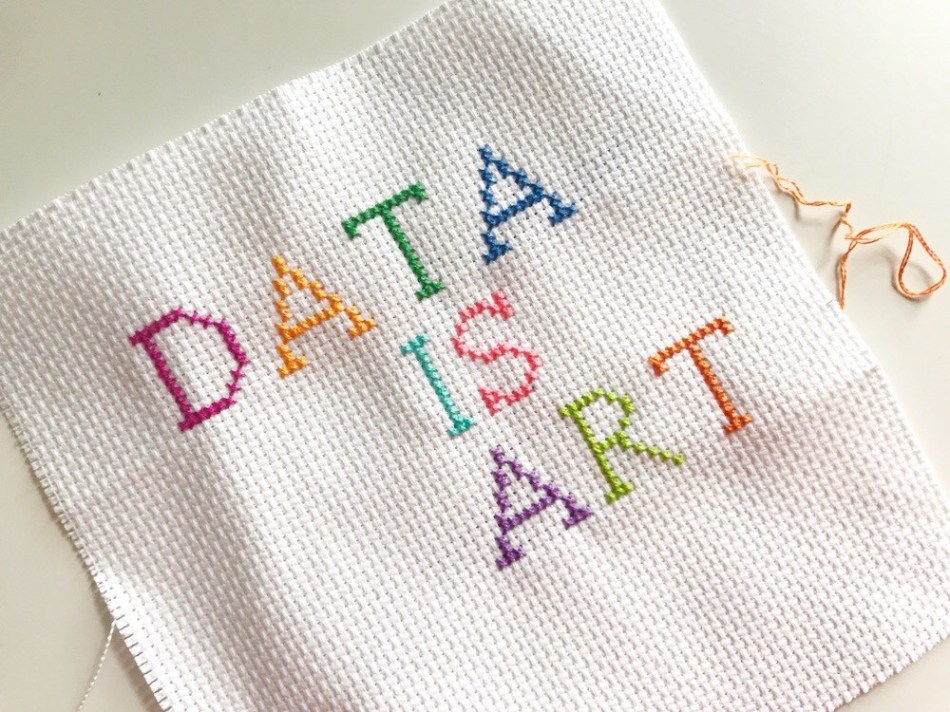
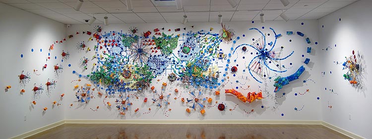
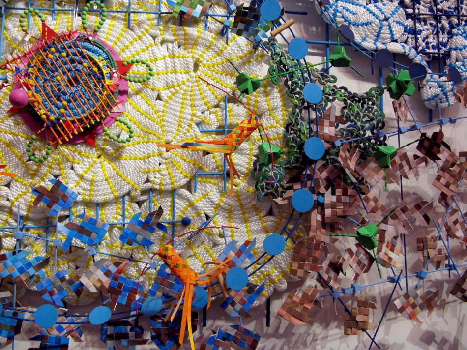
IMAGE 01: Original CrossStitch, Kristen Bourgault
IMAGE 02: Climate Crisis Scarf, Joan Sheldon
IMAGE 03: Tempestry Project
IMAGE 04: The Burden of Every Drop, Nathalie Miebach
IMAGE 05: Changing Waters, Nathalie Miebach
IMAGE 06: Changing Waters (detail), Nathalie Miebach
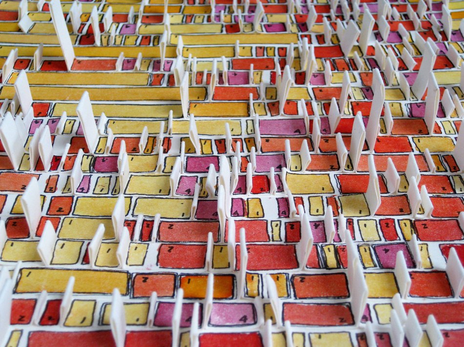
IMAGE 07: Woven Chronicle, Reena Saini Kallat
IMAGE 08: Woven Chronicle (detail), Reena Saini Kallat
IMAGE 09: Sleep Blanket, Seung Lee
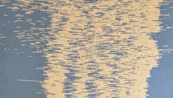
IMAGE 10: Train Delay Scarf, Claudia Weber
IMAGE 11: Night, Laurie Frick
IMAGE 12: Sleep Drawings, Laurie Frick
IMAGE 13: Sleeping Drawings (detail), Laurie Frick
IMAGE 14: Clothing Line, Giorgia Lupi
IMAGE 15: Sweater, Giorgia Lupi
REFERENCES
Bushe, L. (n.d.). Simplicity, Symmetry and More: Gestalt Theory and the Design Principles It Gave Birth To. Blog Post. Canva. (Module 2)
Frick, L. (2017). Why is this not data visualization? Show me the data. Blog Post. Laurie Frick.
Gavenus, E. & Pelto, J. (2017). Bringing scientific data to life through art: Jill Pelto constructs effective ways to communicate science through art. Blog Post. Stanford Millennium Alliance for Humanity and the Biosphere.
Haridy, R. (2017). Art in the age of ones and zeros: Turning big data into art. Blog post. New Atlas.
Hill, J. (2016). Woven chronicles. Website. World Architects.
Lasane, A. (2019). Meteorological data visualized as mixed media sculptures by Nathalie Miebach. The Colossal.
Lien, J. (2019). The four principles of visual storytelling. Blog post. Action Graphics. (Module 1)
Losowsky, A. (2011). Introduction. In R. Klanten, S. Ehmann and F. Schulze Visual storytelling: Inspiring a new visual language (4-7). Berlin: Die Gestalten Verlag.
McCandless, D. (2009). What makes a good visualization? From Information is Beautiful
Meier, A. (2013). The quantified self. Artdesk, (1).
Miebach, N. (n.d.). Weather Scores. [website]
Miller, M. A. (2019). Meet the designer obsessed with the stories that live inside our data. Vanity Fair.
Murphy, H. (2017). Seeing through data: Visiting the museum with the eyes of an information designer. Blog Post. MoMA.
No Author. (2016). Meet 6 artists who have swept data art into the digital age. Blog post. Infogram.
No Author. (n.d.). Data visualization beginner’s guide: a definition, examples, and learning resources. Blog post. Tableau.
No Author. (n.d.). Information visualization: A brief introduction. Blog post. Interaction Design Foundation.
No Author. (n.d.). The tempestry project. Website.
Norman, D. & Ortony, A. (2006). Designers and users: Two perspectives on emotion.
Richman-Abdou, K. (2019). Doting data translates his baby’s sleep pattern data into a cuddly knit blanket. Blog Post. My Modern MET.
Russmann, U. & Svensson, J. (2017). Introduction to visual communication in the age of social media: Conceptual, theoretical and metholological challenges. Media and Communication, 5 (4). Pp 1-5. (Module 1)
Schwab, K. (2019). Crafting takes a dark turn in the age of climate crisis. Blog Posts. Fast Company.
Sydell, L. (2018). An artist sees data so powerful it can help us pick better friends. All Things Considered, NPR.
Urist, J. (2015). From paint to pixels. The Atlantic.
Walter, E. & Gioglio, J. (2014). The Power of Visual Storytelling: How to Use Visuals, Videos, and Social Media to Market Your Brand (Module 1)
Watson, H. J. (2017). Data Visualization, Data Interpreters and Storytelling Business Intelligence Journal 22 (1) (Module 3)

This is super interesting and beautiful! I am studying statistics right now in college and It’s really cool to see the intersection between stats & art.
LikeLike