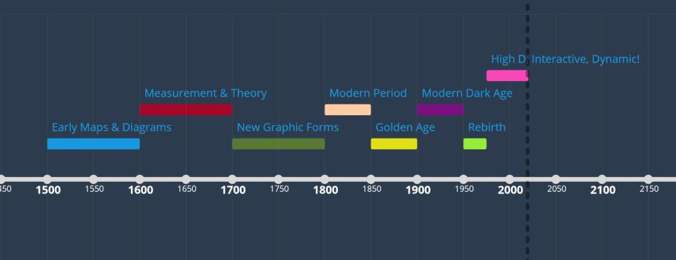
Data visualization sounds like a relatively new term, but the concept has been around since the 1500s, as cartographers used maps to make broad strokes about our surroundings, and early scientists tracked movement of bodies in the sky (Friendly, 2006). The field then evolved over hundreds of years, as new measurement instruments were developed, social and political data was gathered, and computer science birthed machines to process statistical information.
Depending on the needs of the time, different types of data were collected to make sense of the natural world, persuade political movements, and demonstrate the need for improved sanity conditions. New graphical formats such as line graphs, bar charts, and circle graphs, were introduced in the late 1700s, bringing with them new ways to present data. During the “Golden Age” (1850-1900) new visual techniques also emerged, including shading and dot graphs, which led to even more nuance being expressed in data visualizations of this time.
The Impact of Computers on Data Visualization
The introduction of computing systems in the early 1960s brought a tidal wave of change to the field of data visualization. Suddenly massive amounts of data could be processed by these quick thinking machines. There was a push back against the visual aesthetics of the data design, and more of a focus on automation of data processing, and new angles into complex sets of data. Meanwhile, designers and journalists countered with a focus primarily on the visuals, with the purpose of creating attractive images that would attract, entice and persuade the individuals who viewed them (Berinato, 2016).
In the 1980s, access to data visualization software tools was more widely distributed, and soon more people were able to process and analyze data, as well as produce graphics to show that data. More and more organizations had access to these tools, who found new ways to craft and leverage data visualizations. As the spread of the internet has democratized access to complex sets of data and tools to develop visualizations, the field of data visualization has broadened once again. While more people can now create charts and graphs more easily, those individuals may have less knowledge and experience of how to do this well. When anyone can create fancy looking graphics, we find ourselves challenged to determine the credibility of such images.
Defining “Good Charts”
We know a good looking chart when we see one. All good charts tell a story. The skeleton of that story can be seen at a distance, and up close the details of the story begins to emerge. A good chart has consistency in labeling and imagery, and includes a key to unlock the innermost mysteries of the design. Finally, a good chart must be built on credible data. At this point in our history, when the access to produce and publish professional looking graphics is so widespread, true data scientists must provide a way for the viewer to verify the validity of the information contained in an chart. Citations and breadcrumbs should always provide a path back to the source of information, enabling us to know that what we are seeing is real.
__________
Timeline created with time.graphics based on data from A Brief History of Data Visualization, by Michael Friendly (2006)
Also referenced, Good Charts, by Scott Berinato, 2016 Harvard Business Review Press

0 comments on “The Evolution of Data Visualization”