This week, as I began my research into data visualization, a funny thing happened. I started to notice all of these data visualization projects were happening around me…in the form of my biggest passion – fiber arts! Could it be that once again, two of my seemingly unrelated interests were actually…connected?
A Visualization Of Men Talking, Constantly
The first project came across my Facebook feed early in the week. A city councilor in Montreal began knitting to stay focused during executive committee meetings, a trick that I personally found relatable (cue image of me knitting during webinars and live class meetings). But there was something unique in her approach – the councilor is knitting with red yarn whenever men are speaking, and green yarn whenever women are speaking. And as you probably could guess…she’s ending up with quite the red shawl.
A Visualization of Temperature Ebbs and Flows
This got me thinking about other ways in which fiber arts could be used to track data, and I was reminded of a friend who created a temperature afghan. Each day she would crochet a row in her afghan, based on the temperature that day. Each temperature range was associated with a color, with cooler colors (purples, blues and greens) associated with cooler temperatures, and warmer colors (reds, yellows and oranges) associated with warmer temperatures. The final product had a really beautiful gradient effect, but also highlighted some abnormalities over the course of the year!
A Visualization of Climate Change Accelerating Towards the End of Times
While looking for temperature afghans, my search yielded yet another connection to a personal interest – craftivism. There is an entire group of knitters engaged in projects which visually show how climate change has evolved over time. Similar to a temperature afghan, but on a grander scale, each row represents the average temperature over the course of a year. During normal years, purple yarn was used. During abnormally warm years – red, and during abnormally cool years – blue. The overall effect raises awareness of the changes which have happened to our average yearly temperature over time. A powerful statement, in an accessible format. And knitting has the bonus effect of calming those of us who are terrified of what the future holds!

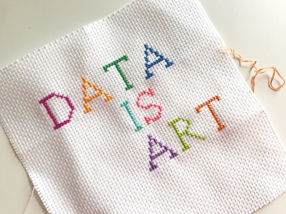
0 comments on “Data is Art”