In our fast-paced, news saturated world, we are constantly bombarded with data and charts meant to influence our thoughts and ideas around a wide variety of issues. As individuals who create some of those charts, graphs, infographics, etc, it is our responsibility to remain ethical in the way we construct the narrative around that data, and ensure that the format in which we deliver it tells a true story.
According to Scott Berinato in Good Charts, “Every chart is a manipulation.” When we consider that every chart is created by a flawed human, who brings their own biases in the selection and presentation of the material, it could certainly be argued that this is true. Each design choice that we make can either add to one side of a story or the other. Therefore it’s important to understand the impact of these choices, and work towards clarity and transparency in the way we construct our data visuals.
the art of persuasion
The purpose of most (all?) charts is to persuade our audience to think or believe that a certain set of information is true. We start off with a question, and then seek to provide an answer to that question through the creation of a chart or graph. We decide what data to pull from, and how to arrange that data on the page. This is mostly done with good intentions – and it is our responsibility as designers to ensure we are representing that information fairly and accurately.
In order to persuade, we must focus our viewer on the key points we are trying to make, through the use of size, color, and titles. Demarcations, or lines on a chart which highlight certain points in time, can be useful for making a powerful statement about the impact of a particular event. We can use isolation to show what is important, while de-emphasizing other aspects of a chart through lighter colors or even grayscale.
the deception of manipulation
While persuasion can be argued as a positive service, there is no positive light we can shed on manipulation. The book, Good Charts, identifies four main ways of using deception in charts: falsification, exaggeration, omission and equivocation. We can also be selective in the data we choose to present, or the scales at which we choose to represent that data.
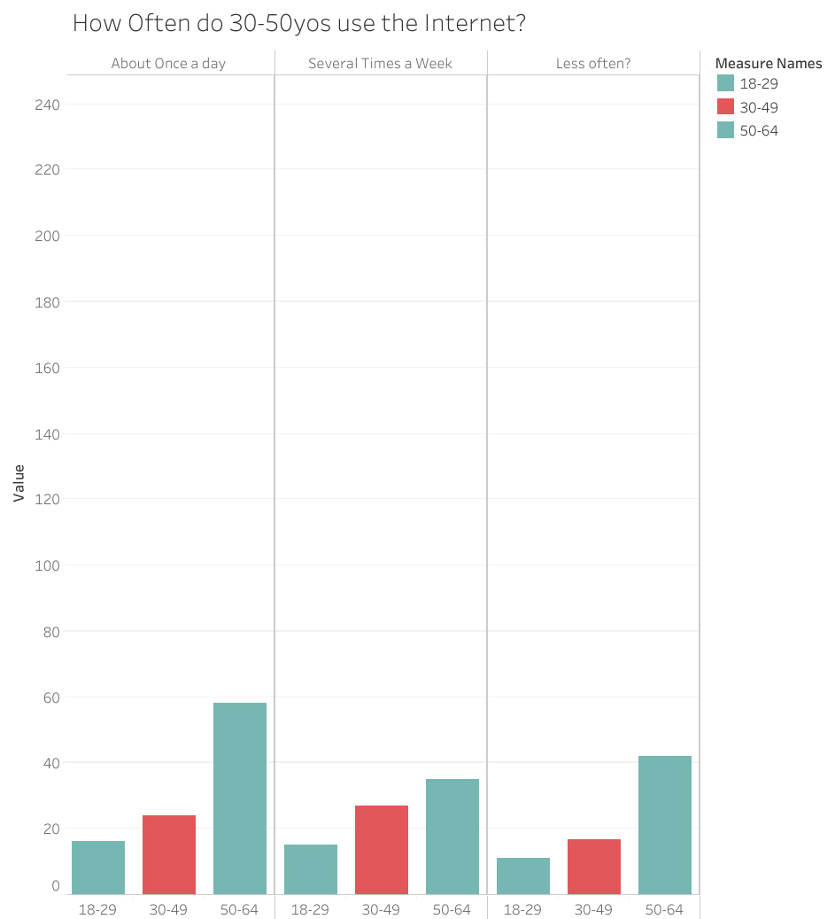
Take the following chart for example. If we were to eliminate the results for “several times a day” and “almost constantly,” this chart would tell a much different story and imply that people in these age groups don’t actually use the Internet that often.
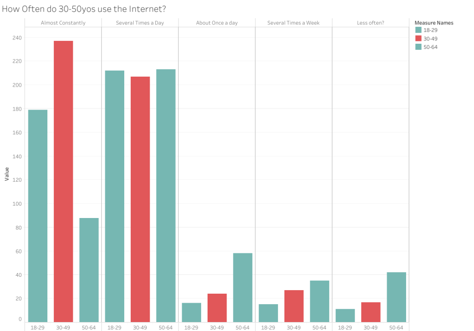
This altered graph tells a different story – and we could therefore argue that most people are not using their phones all that much. It’s easy to see how simple changes to a data set or the way it’s presented can tell a dramatically different story. Determining whether you are merely persuading someone to see your viewpoint, or manipulating them into believing a lie is your responsibility as a designer.

0 comments on “Using Data to Gently Nudge, But Never Lie”