When done correctly, charts and graphs can have a powerful impact on the viewer, presenting a strong argument, showing a trend, or illustrating a point. However when done poorly, charts can have a negative impact perception, clarity and understanding. Here are a few “bad charts” from the website WTF Visualizations, along with a brief explanation of what went wrong.
BAD CHART: THE CRAZY CLOCK

My immediate reaction to this graphic is stress, not leisure. The title “peak time” leads me to believe we are looking at a clock – which is reinforced in the key to the bottom right. So each element is marked on this clock to indicate the “peak time” when that activity is performed. This is clear enough, and actually isn’t a bad underlying concept for a visual. It’s when we start tilting the lines to indicate “the linear regress slope of each activity’s popularity” that things get a little crazy. In addition to the angle (which itself is difficult to decipher), we also need to concern ourselves with the point at which the outline of the clock intersects the line itself. This means something. I don’t really understand what, and at this point I don’t care. I’m overwhelmed. It seems we are trying to show way too many things in this visual.
Some ways to clean it up:
- Decrease the number of lines and colors by putting the activities into broader categories. For example, “team sports,” “working out,” and “hunting/fishing” could all capture a few of the activities.
- Shorten the lines and place them around the clock to show peak popularity (the theme of this visual)
- Create an additional visual that shows the popularity trends over time, matching the color of each activity to the clock visual for consistency.
Better use of the clock metaphor

This visualization, designed by Alissa Scheller for The Huffington Post, makes better use of the clock metaphor. Small colored bands indicate time periods, and bubbles on the outside provide an additional layer of information. A simplified color palette creates a visual that doesn’t overwhelm us at first glance.
BAD CHART: INCOMPARABLE DIALS OR DONUTS

Shockingly, this is not a Pokemon visualization. The pie charts look accurate in their construction, but the gaping white wholes in the middle are distracting to the eye. These holes also seem to move around, rather then being centered (which would perhaps make them LESS distracting, or at least we wouldn’t spend time wondering why they were moving). The data is also really hard to digest in this format. This simply is not the correct type of chart for this type of data.
The best solution to improve this image would be to create a line graph. A line graph is a type of graph which is perfectly suited to showing trends over time, such as the image below.
BAD CHART: WOMEN DO MOST OF THE WORK, NONE OF THE PAY

This reminded me of some of the “tableau gone wrong” experiments I conducted last week. It also reminded me exactly how it feels to be a woman 90% of the time.
To start with, the title of the chart doesn’t make much sense when you look at the image. “Diversity in tech salaries”…but what does it mean? My gut tells me two pyramids, side-by-side, might work better, one for men and one for women. Then each could be broken down by the categories of “paid too much,” “paid enough,” “paid too little.”
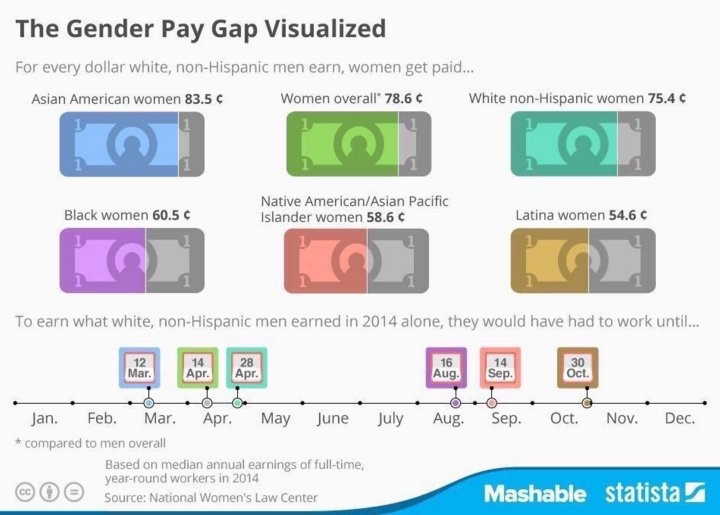
A better visual for demonstrating the pay gap is featured below from Mashable. Instead of trying to fit the data into one visual, this graphic makes use of several pictures of the dollar to show the comparison. It also shows the complexity of this issue – rather than only creating buckets for “men” and “women” which oversimplifies the conversation.

0 comments on “Bad Charts Are Worse Than No Charts At All”