
Introduction
Can we teach people how to be effective digital storytellers?
We can certainly teach visual literacy. Visual literacy is the ability to interpret images that we see, to make meaning out of the carefully assembled shapes, lines, and colors. Visual literacy helps us to understand what we are seeing, based on an understanding of principles of color and style, as well as the Gestalt principles such as proximity, simplicity, similarity, and continuity. Using these principles, we can begin to deconstruct the elements that make up an image.
But we also have to understand how our own interpretation plays into our perception of what we see. Our first reaction to an image happens on the visceral level, which is our immediate, “gut” reaction. This reaction comes from our biology, from the place that interprets danger versus safety. We also have a behavioral reaction to what we see, where we begin to take our interpretation a bit deeper, based on our learned behavior. Finally, we have a reflective response, which requires self-examination and connection with our own experience and culture. Where a group of people will likely have a similar visceral reaction, the reflective reaction is the point at which the group starts to diverge and people form their own opinions on what they are seeing.
It is possible to study and better understand the three ways in which we respond to images, as well as some of the guiding principles of Gestalt psychology and the elements of visual communication. However there is a big difference between our ability to interpret images, and our ability to create visual stories. The leap is similar to that of someone learning to read. You start out by teaching the elements of language – the letters, grammatical rules, and sentence construction. However once we learn to read, we do not automatically become good . That transition from consumers to producers is much harder to teach, and requires an extensive amount of practice and feedback in order to get it right.
Emotion is something that we can work to convey in our own images if we want to tell powerful stories. By employing the principles of perception as well as the tools of design, we can create images that bring about varying intensity of emotion. We can leverage the Gestalt Principles, which remind us that “the whole of something is more important to our understanding than the individual parts.” These principles help us to understand how a person will interpret what they see in an image. They include ideas such as:
Similarity: Similar objects are part of a group
Enclosure: Objects surrounded by a boundary go together
Continuation: Our eye creates a path of motion from one object to another
Closure: Our eye completes incomplete objects
Proximity: Objects that are physically close are part of a group
Color is another way we can manipulate the viewer’s emotional reaction to the images we create. We can use the typical associations that people have with color to inspire a feeling or assign a value. For example, red is often used to show power or anger; while blue can be employed to promote calm or sadness.
Using Plutchik’s Wheel of Emotions, we can analyze the emotional impact of an image on the human psyche, and identify which emotions it is attempting to portray, and to elicit in the viewer. The following three images illustrate varying degrees of sadness. First, the milder form of pensiveness. Next, a deeper response of sadness. And finally, the ultimate expression of sadness, which is grief.
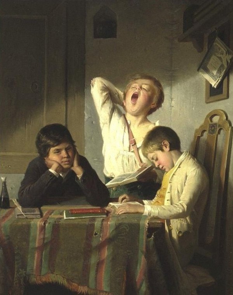
Bored with Lessons, by August Heyn
August Heyn’s painting, Bored with Lessons, uses fairly muted colors, but is rich in its detailed depiction of three boys. The lines are soft and the image is familiar – it doesn’t do much to evoke a strong visceral reaction. There are three boys at the table, and their close proximity leads us to believe they have a relationship with one another, and that they are having a shared experience. They are making various facial expressions that give us clues as to what they are feeling.
The standing boy is yawning, perhaps the strongest physical reaction to the situation. From his yawn, we can interpret that he is tired and likely sick of whatever he is doing. We can then transfer this emotion onto the other boys, whose faces are less expressive but who are likely sharing similar feelings as the boy near them. One boy is looking out into space, which we can now interpret as likely daydreaming or losing focus on his tasks. The other boy has his head down, again interpreted as starting to nod off from boredom.
The painter has given us other clues as to why these boys might be bored. Books and pens on the table, and in the boys’ hands, indicate they are likely reading and studying. The tattered tablecloth reinforces the idea that they have been at it for some time.
When we view this image, we feel that emotion of bored, and we may even find it relatable to our own experiences of losing interest in our studies. However the image does not cause us to have a passionate physical reaction – rather it’s just an image expressing a captured moment in time.

The Old Guitarist, by Pablo Picasso
Pablo Picasso’s The Old Guitarist is another fairly simple image, using basic strokes and a little indication of depth between the figure and ground. The shapes are easily recognizable as a man sitting, playing a guitar. It’s also simplicity in its use of color – the entire painting is covered in a blue hue, creating an almost monochromatic effect.
Our initial visceral reaction to this painting is one of sadness, and the more time I spend with it, the more I feel that reaction myself. The blue color evokes that sadness in us, and has a powerful impact on our initial gut reactions that this is a picture of sadness and depression. As we study the man more closely, in his hunched over position and with the details of his ripped shirt, the concept is further reinforced.
When we remove the color from the painting, it becomes less depressing. The man is still playing the guitar, but the overwhelming feeling of sadness is not as apparent. Consider then if we add a yellow hue over the entire painting. Now we can almost imagine a feeling of satisfaction on the man’s face, as he loses himself in the playing of his music. This is a great example of the way color can impact our visceral or immediate reaction to an image.


Sully, the Service Dog of Former President George H.W. Bush
This photograph, taken by Evan Sisley at the funeral of Former President George H.W. Bush, instantly became a viral testament to the unwaivering loyalty of dogs. The image is once again one of simplicity – a dog lays in front of a casket. The casket is draped in an American Flag, elevating its level of significance.
This photograph is interesting if we consider isolating just the dog. Gestalt principles indicate that the whole of something is more important than the individual parts – seeing the dog in isolation, we would assume it was just a sleeping dog. The viewer’s reaction might be positive or negative, depending on their own experiences with dogs in their lives. However by enclosing the dog in the same frame as the casket, a more powerful impact is created. We use this context to make a connection between the dog and the person who is inside the casket. Then, rather than assume the dog is simply taking a nap, we ascribe sadness to the dog, along with grief and long. This grief is transferred to us, the viewer. Whether or not the dog itself is experiencing grief in this photo, we experience grief as we view it. The image is powerful in its invocation of loss, and creates an image that is universally understood to be one of grief.
Conclusion
In the above three examples, we see how visual artists can leverage principles of Gestalt psychology, as well as the psychology of color, to create strong emotional reactions in viewers. Understanding these principles is essential to developing digital literacy, and an ability to interpret an artist’s intentions. Using those principles oneself to create powerful visual stories is the next step.

I think you chose fascinating images to describe the three tiers of sadness. I think your choices for sadness and grief are fantastic, especially in the alterations you did to the sadness picture to show how colors affect how a viewer intakes a painting. I loved how you talked about what goes into a photograph in the grief picture, choosing to isolate the dog at first and seeing how each part adds to the viewer’s reaction. I was most confused by the first picture, representing pensiveness. To me, pensiveness is a sense of struggle and brooding over a thought, trying to find answers to a looming thought which leads to a form of sadness. I think the overall bored tone that comes from the first picture evokes different feelings from what I would define as pensive, but I see your take on it definitely. I just found that picture more to be showing a type of wonderment or daydreaming, but especially with the boy on the left, I could see where you could find the pensiveness.
LikeLike
Hi, Kristen;
One of the things I’m enjoying about this class is how we all see images in different ways. For the most part, we’re all in different stages in our lives and have had slightly varied experiences, so our behavioral reactions and reflective responses differ somewhat. I’m appreciating the perspectives.
I love the picture of the boys bored with their studies, probably because it’s so completely relatable. In the late afternoon or evening light, they’re done in, and that table cloth has had enough. I can see the pensiveness, but the emotion that comes to me when I look at this image is on the opposite side of Plutchik’s wheel; it makes me feel calm. Peaceful. Serene. I think that the warm afternoon sun helps with that feeling. It makes me want to lay outside and NOT do schoolwork.
So much of Picasso’s blue period work reeks of sadness and grief. This is another example of a painting where we know where the artist was in his life, and that gives us a more in-depth perspective into his work. But everything from the sharp angles, the figure’s posture, the deep shadows, ripped clothes, and the use of such dark blue drips with sadness. And like you said, the more you look at it, the more you feel the sadness yourself. I think the painting of the old guitarist does that to everyone.
Thank you for sharing.
LikeLike