
The Rising Need and Value of Data Visualization
We are currently experiencing an explosion of data – more data is being collected about us than ever before through our clicks and interactions on the Internet. And more data is being shared with us than ever before – just submit a simple Google search and take in the results that appear. Data is all around us, but our human brains are not quite equipped to interpret data as well as our computer counterparts. We struggle to find patterns and understand the information that data represents.
In contrast, humans can understand visuals. According to Hugh Watson, “The science behind data visualization shows that humans can readily distinguish differences in line length, shape, orientation, size, placement on page, and color with minimum cognitive effort.” This explains why we have seen a rise in data visualization – the art of using visuals to represent data in ways that are easier for humans to analyze and interpret.
Simply creating visuals out of data does not always yield successful results. Good data visualizations must first start with accurate data. They then work to convey a specific concept or meet a specific goal. Finally they must be presented in a pleasing visual form that adheres to good principles of visual design. Without all of these elements, the visualization will merely continue to add to the noise of the data.
When we create visuals to represent data, we need to be sure the visual design is compelling enough to grab the viewer’s attention, and then well organized enough to hold it. The way we arrange the visual elements will encourage viewers to try to interpret the data and make meaning from the information we are presenting.
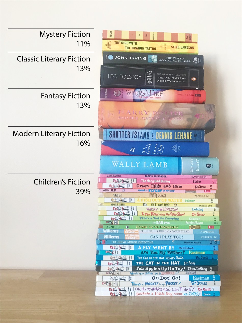
Most Popular Book Genres of All Time
When thinking about ways to visualize quantitative data with objects, I had to think first of the objects I had at hand in large quantities. Of course books came to mind! I found some statistics of the most popular genres of books. Ola Kowalcyzk had create a pie chart showing the distribution of different genres compared to overall sales of books.

I thought this would be a great set of data to visualize using a stack of books. I selected books that fit within the genres and that shared the same colors on their spine to make it easy to differentiate between the categories. Since there were so many different colors in the stack of children’s books, I decided to arrange by color to create a more organized vision. The overall impact demonstrates a more visually interesting way to present the data than in a standard pie chart. However it still felt rather simplistic, and lacking in edgy charm.
Trump’s Tweets
I then came across some interesting data, published by the New York Times this week, presenting an analysis of the types of tweets that Trump has sent out since becoming President. The dynamic article itself is a work of data visualization art – using visuals to really emphasize the sheer volume of tweets sent by the President around specific topics. However I wanted to take that data and present it in a more simplistic format.
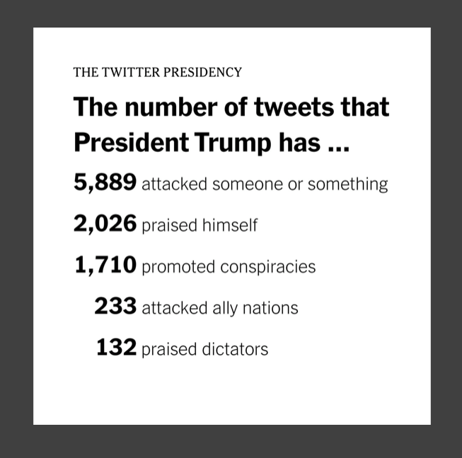
This presented a far more interesting challenge, as I had to find a way to visually represent something more complex than genres – but rather concepts. My son’s army men immediately came to mind – these would work well to represent “attack tweets,” and I knew we had a large quantity of them. To simplify the graphic, I stuck with objects that came from the children’s “toy box” – sequins, puzzle pieces, and Lego comprised the other sections. I drew a circle on my desk with chalk, and divided it into pie slices to make the layout easier to achieve.
In retrospect, a pie was not the best choice considering these categories represent a subset of Trump’s tweets, rather than making up the entire whole. I also think using a monochromatic arrangement of army guys would have reduced the visual noise of the overall image. However, all in all, I think the image does a great job of presenting some of the most troubling highlights of Trump’s Twitter catalog, especially in conveying the story of the sheer volume of tweets the President of the United States has made attacking someone or something.

Data Visualization, A Language of the Future
The visualizations I created to present simple statistics demonstrate the power of using the elements of shape, size, color, and placement to convey meaning to a viewer. As we continue to amass large quantities of data in the future, the skill of presenting it in a meaningful way that is accessible to the majority of people will become even more important.
As you set out on your own data visualization journey, keep in mind the three benefits of visual storytelling from Hugh J. Watson:
- Helps people get the gist of an idea quickly
- Helps them remember facts much better
- Creates a memorable and enjoyable experience
By keeping these principles in mind, you can create powerful visuals that convey vast amounts of data through a single image.

0 comments on “Information Still Life: Visualizing Data Through Inanimate Objects”