As part of the Data Visualization course I am taking this summer, we have been tracking data about ourselves and our lives, and then creating colorful postcards to display that data in interesting ways (based on the Dear Data project).
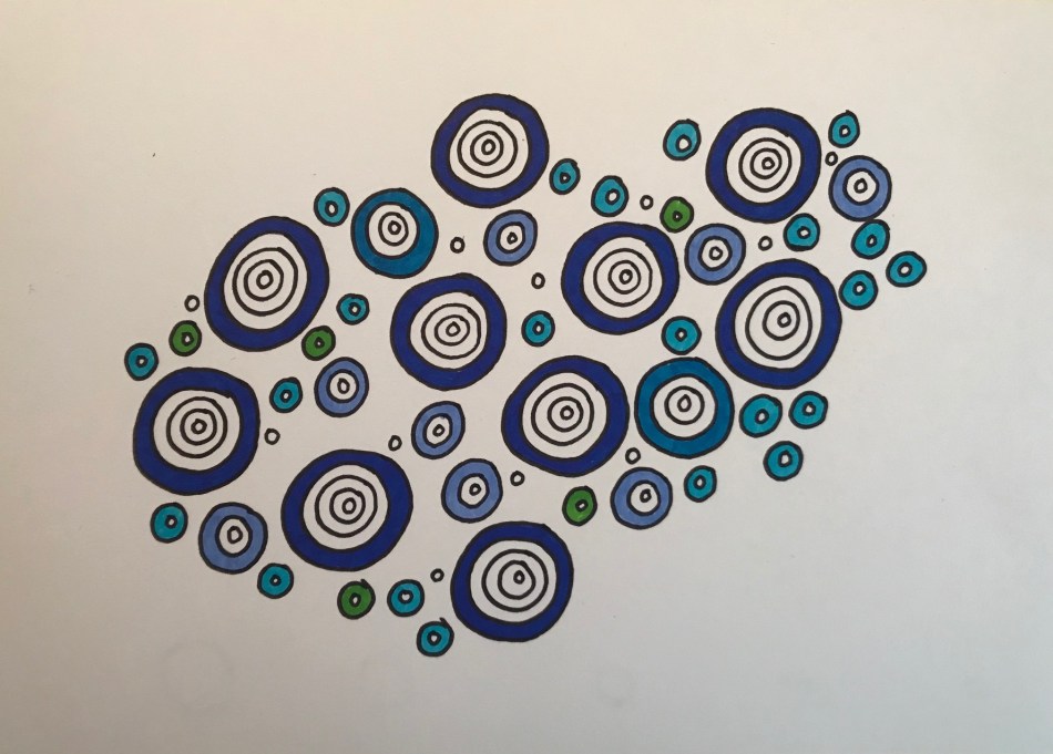
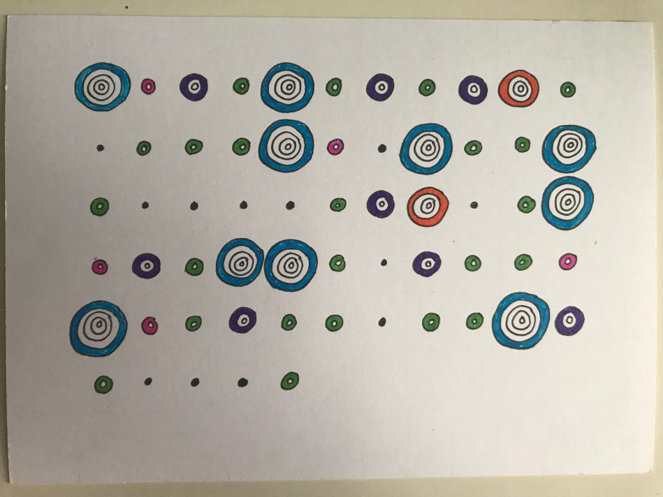
My daughter just wrapped up an incredible season of slow pitch softball, so I decided to create a visualization of her hits each time she went up to bat. Each dot represents a time at bat. And the rings show the results. Based on this key, you can see she had a pretty darn good season!

The first version of this visual was meant to show my daughter the overall impact of her season. I didn’t necessarily want her to see trends in the data, especially since the last few games were not the best games – which isn’t a good way to end the season. Here is a new version, which shows the progression of her hits over time, in chronological order, throughout all 17 games.


0 comments on “A Season of Softball”