In this season of my life, I play many roles: mother, professor, mentor, designer, student. These roles push me to fill my days with two of my favorite activities: teaching and learning.
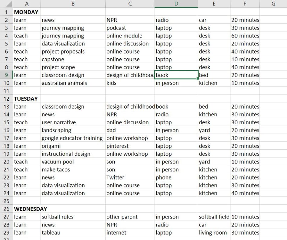
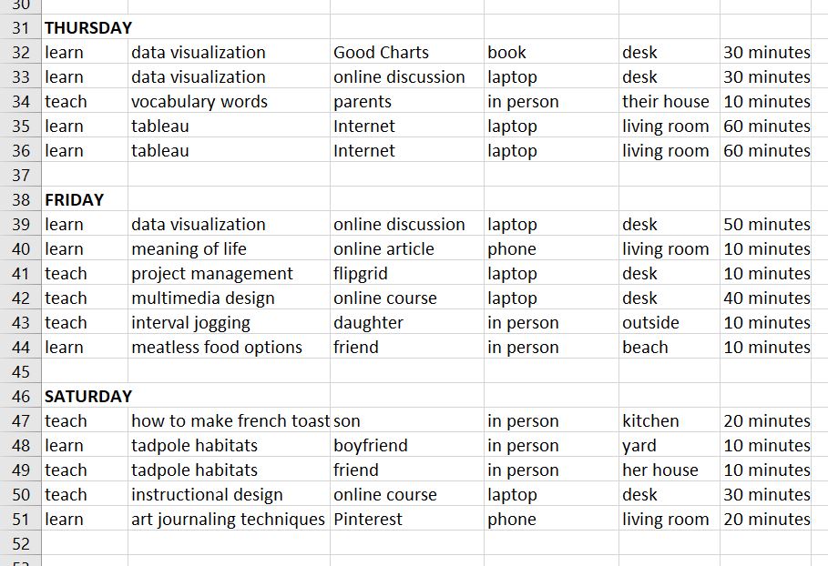
This week I decided to track what I was teaching and what I was learning. It was a fun exercise. It was incredibly hard to track this kind of information, especially for the more informal learning that took place away from my desk. However looking over the data I was able to track, some definite patterns emerged:
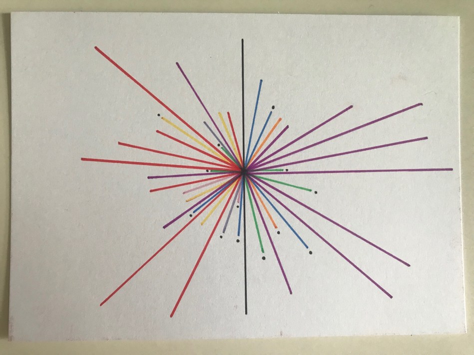
- I learn more than I teach
This does not actually surprise me. I consider myself a lifelong learner, and I spend a lot of time trying to learn new things across all genres and disciplines. - The biggest category of new learning was data visualization
As a graduate student currently taking a data visualization course, this makes a lot of sense. Since my faculty workload is significantly lighter in the summer, I can spend a lot of time on this course. - The biggest category of teaching was instructional design
I am currently teaching two instructional design courses, so this makes a lot of sense. In this visualization, instructional design became a catch-all category for a lot of diverse topics: multimedia design, project management, writing, and project planning. - I learn about a wide range of topics, but only teach in a few specific areas
I was surprised by this – the colors are much more diverse on the left. As a mom, I would have thought I taught more things that I do. Or perhaps those things are just more difficult to track. - I frequently teach and learn things in microbursts, with longer, focused time spent infrequently and only in specific areas
The visualization is filled with many shorter lines, and fewer long lines. The long lines show focused periods of studying and/or working. However I am constantly learning things in very short periods of time.

I kept a daily running log in my small notebook throughout the week, but then converted the data into an Excel sheet to take a closer look at trends and patterns.
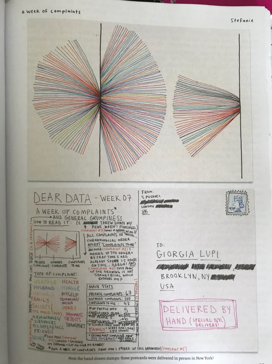
The visual for this project was inspired by one created by Stefanie Posavec in the Dear Data project. She clearly had a lot more data points to visualize!!

0 comments on “A Week of Teaching & Learning”